riff raff
brewing co.
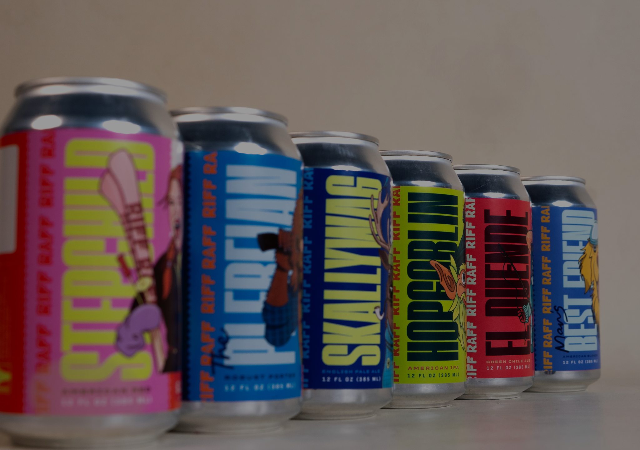
Primitive partnered with Riff Raff Brewing Company to bring a unique look to the crowded Colorado craft beer scene.
branding
with
character
+ objective
Our guiding objective for this project was to update but not redefine the Riff Raff brand. This meant staying true to the roots of Riff Raff and Southern Colorado, while creating distinct labels that generate immediate impact for customers.
+ DELIVERABLES
Branding
Messaging
Packaging
+ DISCOVERY & SCOPE
This project involved an extensive discovery phase, where we worked closely alongside Riff Raff stakeholders to understand the identity, market, and competitors.
Final deliverables included:
- Updated logos
- Refreshed style guide
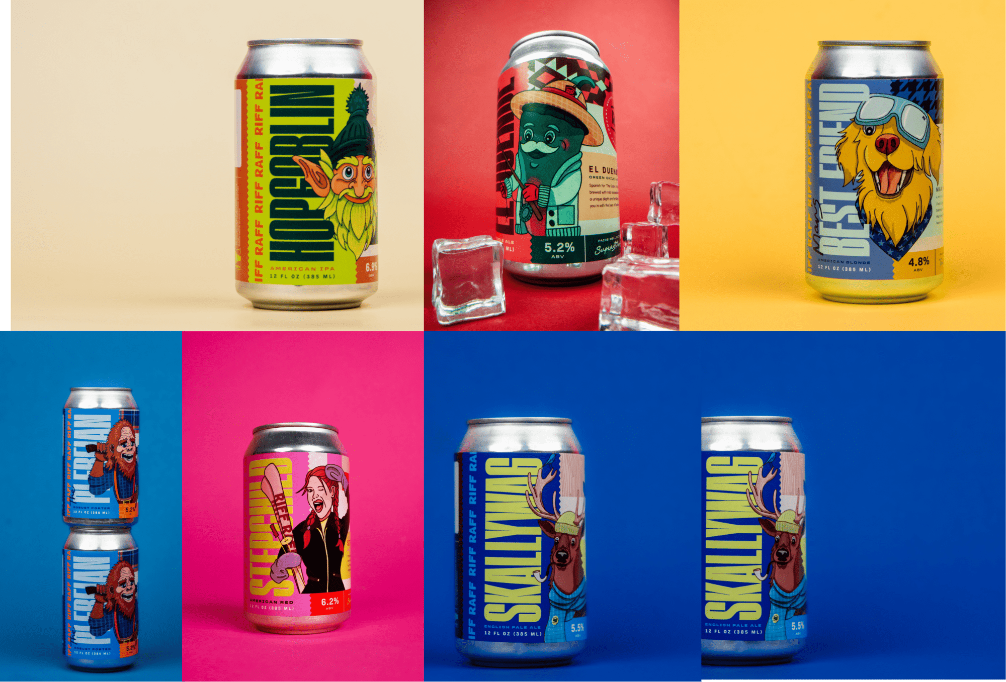
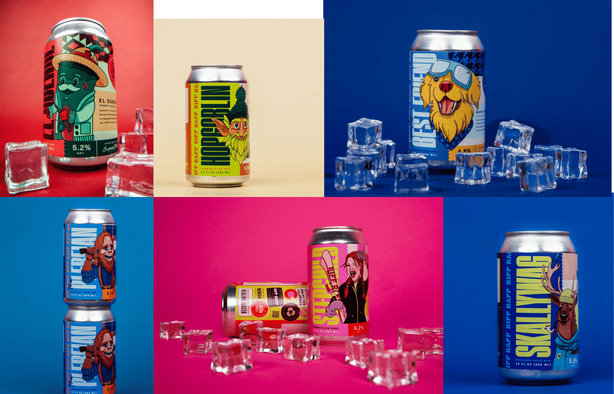
- Six new production-ready label designs for their flagship beers.
+ THE BEFORE
Riff Raff came to the table with dated label designs for their six flagship beers. The brewery felt they had outgrown these labels and sought to update their look to distribute and compete regionally.
The goal was to retain the authentic spirit of Riff Raff, while bringing the brand up to date.
Through collaboration and iteration, we landed in a place that was bold and modern, but did not take itself too seriously.
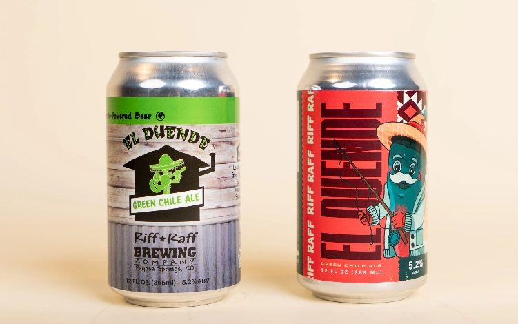
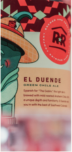
EL DUENDE GREEN CHILE ALE
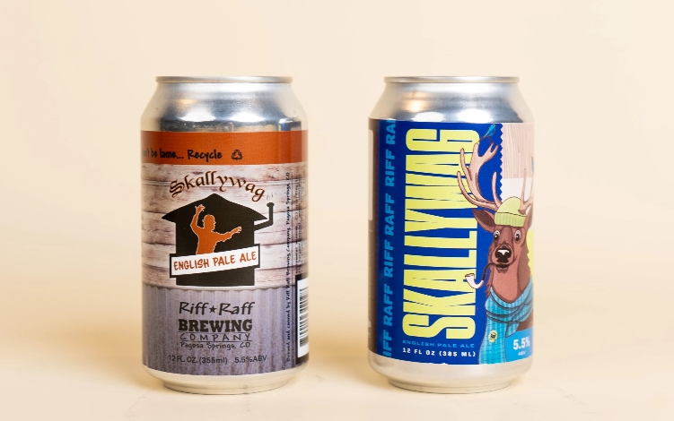
SKALLYWAG ENGLISH PALE ALE
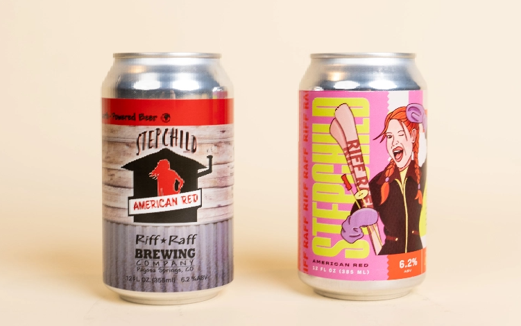
STEPCHILD AMERICAN RED
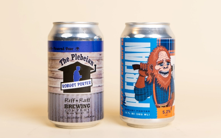
THE PLEBEIAN ROBUST PORTER
+ REFRESHING THE BRAND
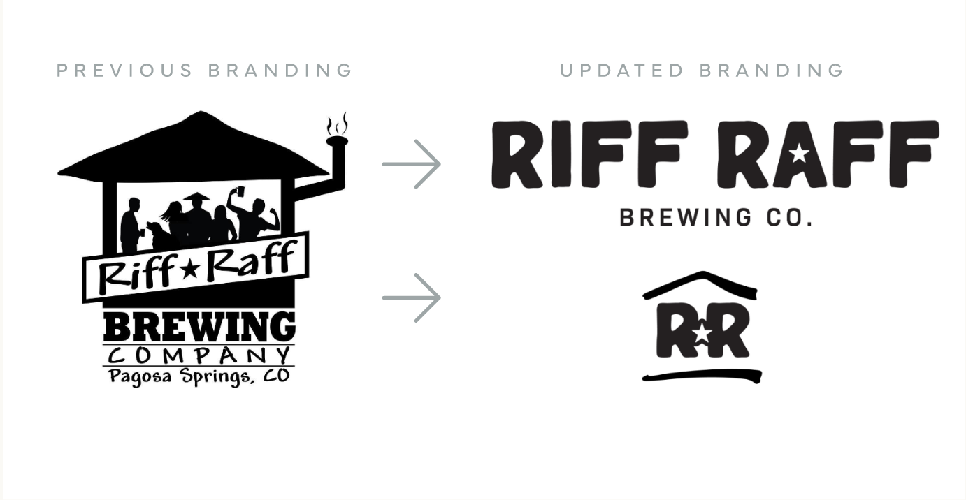
Updating the identity of Riff Raff began with their core brand assets. We brought a more modern and bold look to the logos and typefaces while utilizing the same symbols and meaning of the original logo.
Final deliverables for this phase involved logo assets, and a style guide that documented their new brand assets and how to use them.
+ SETTING THE MOOD
When deciding on a direction for beer labels, the possibilities really are endless and can become difficult to visualize.
In order to collaborate effectively and to hit the mark more quickly, we employed a mood boarding process with Riff Raff to get an idea of the stylistic direction.
These mood boards captured a variety of different directions from illustrative to type-forward concepts.
The boards ultimately served to help everyone get on the same page, and to move forward into the next phase confidently.
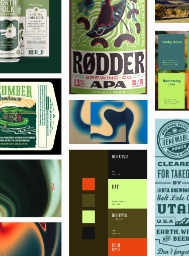
VIVID + EARTHY
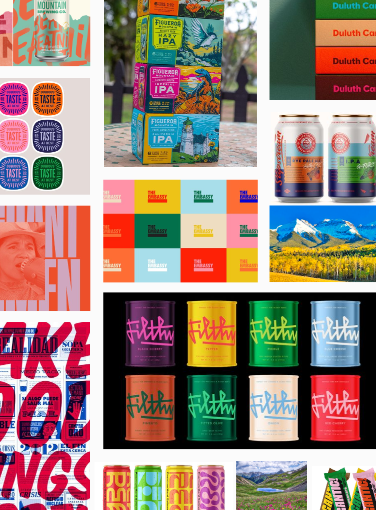
VIBRANT + ENERGETIC
+ BUILDING CHARACTER
The stylistic direction agreed upon was an illustrative approach that placed the flagship characters at the center of the story. These characters serve as a representation of the distinct personalities and profiles of the beers themselves.
Through a process of collaborative concepting and revision, our team was able to bring these unique characters to life.
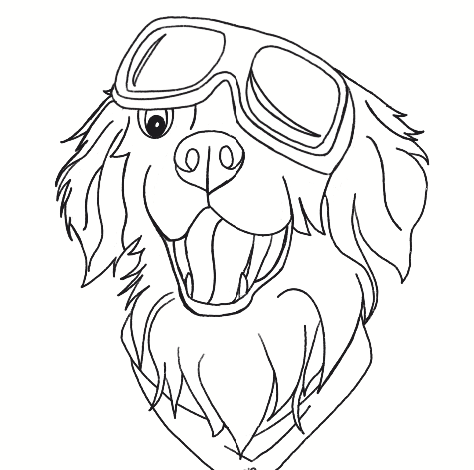
MAN’S BEST FRIEND SKETCH
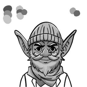
HOPGOBLIN SKETCH
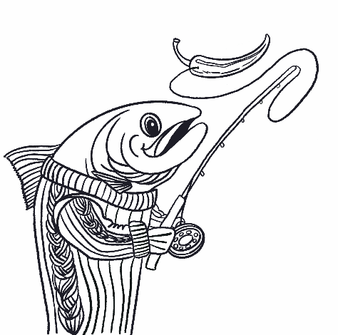
EL DUENDE SKETCH
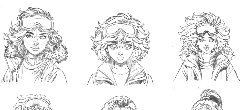
STEPCHILD AMERICAN RED SKETCHES
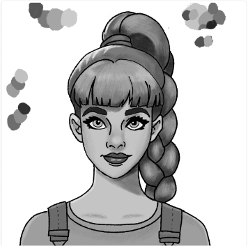
STEPCHILD AMERICAN RED SKETCH
+ SENDING A MESSAGE
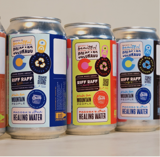
The process of defining our messaging and copy began with research surrounding Pagosa Springs history and Colorado culture. The location of the brewery and Riff Raff’s community is integral to their story and who they are, so we wanted to capture that in our writing.
We then worked with designers and the client to ensure the voices we were writing were true to the characters’ spirits.
Special care and attention went into ensuring every word the labels carried weight and spoke into who these characters are.
+ OUTCOMES
Through hard work, dedication, and a lot “Riff Raff” spirit, the branding and labels came to life. The designs, illustrations, colors, and copy embodied a new, more modern era for the client, while maintaining the core of who they are and why the locals and regulars love them so dearly.
