branding
+ positioning

Are you using all of your business assets for brand growth?
We love a memorable, descriptive, on-brand logo. What do we love even more? When positioning, design systems, and consistent content back that logo. Because your brand is more than a logo, color scheme, or keywords: it’s all the pieces that shape client perception.
logo design • style guides •
positioning strategy • design systems •
Strong branding increases a business’s value
We know this is a bold claim. But industry and client data back us up. And the why in, “Why does branding increase my business’s value?” is answered by exploring what branding and positioning actually are. Branding isn’t just a logo or a defined color palette. Positioning isn’t just a media strategy.
Innovator and marketing guru Tom Goodwin describes new branding as:
What this means for you: branding isn’t just aesthetics. It’s every piece of the brand that potential or future customers come into contact with. And every word, email, post, website page, mailer, swag gift, or t-shirt should consistently draw on what defines your brand.
We’ll partner with you to understand your brand, your business goals, and your why to create branding that is positioned to show the best version of your business.

what we
deliver
deliver

Award-Winning Visuals and Logos
Messaging Guidelines for Your Whole Organization
Branding Assets That Stand Out
Research-Driven Launches
Award-Winning Visuals and Logos
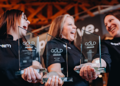
Whether you're looking for an update to a beloved brand's logo or need a logo for your brand-new business, we've got you covered. For a logo update, colors, business names, and main symbols stay the same, but fonts, positioning, and size may change to give a streamlined, updated feel. With a redesign or brand-new logos, expect the spirit of the brand to be reflected, but get ready to be impressed. Our ADDY award for branding says that it's more than us and our clients that can't stop looking.
Messaging Guidelines for Your Whole Organization
How many times have you responded to formatting questions? How long do you spend making changes to guest posts or freelance writing before it's ready to go live? Our messaging guide is a working document your organization can continually update as your company grows and changes. We cover grammar, punctuation, formatting, style and tone, voice pillars, messaging, word banks, content formatting, platform content boot camps, and editorial checklists.
Branding Assets That Stand Out
12,000 views in two weeks. Those are real video stats from a healthcare industry client. When it comes to branding and positioning, you need more than a logo and messaging. You need scripted or produced videos for broadcast or social media that tie into your brand goals and values. And if your business sees people in person, you may want additional branded items. Working with a true partner, like Primitive, means we'll come alongside you to ensure those items relate to your brand, your logo looks good, and any messaging is in your brand voice.
Research-Driven Launches
$1.4 million raised in 30 days after a nonprofit launch, and over 9,000 website sessions generated from social media from a client that started with a complete branding package for their new nonprofit organization. This organization, led by a successful energy-industry CEO, knew that their go-market strategy needed to be informed by professional branding built on customer research, proven creative abilities, and a positioning created from a unique understanding of the mission and audience.
client wins
Every victory is worth celebrating—and neuroscience backs this up. Gains with Primitive are measurable. We hook you up with analytics and real-time reporting so you can see how we’re winning for you. We’d love to go client by client and tell you how we’ve helped their brand grow, but then this page would be an endless scroll. So, here’s the highlight reel!

We had the opportunity to create the sam logo at the business's conception. The logo is dominated by black and lightened by yellow and green, bringing an energetic, fresh feel that perfectly mimics their services and mission.

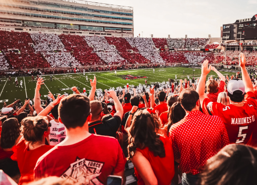
For the Red Raider Club, we took a "throwback" approach while still bringing their branding into a modern age. The vintage Texas Tech logo and modern typeface and design create an eye-catching, impactful visual.

Our revamp of the ELC logo brought their branding from the past into the future. The bright colors and clean design provide a mature, professional appearance while still appealing to the children they serve.
WHO WE WORK WITH


_FullLogo_Navy%201.png?width=200&height=100&name=McCaslandClothingCo%20(1)_FullLogo_Navy%201.png)

our latest

WONDER HOW WE MAKE THE MARKETING