BLOG The Building of Stitched
The Building of Stitched
POSTED BY Danielle Holmes | Apr 22, 2022

It all started with an offhand comment.
But, isn’t that how all the best stories start?
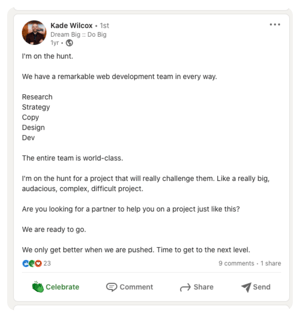
And while our founder, Kade Wilcox, might have asked a future client to bring our team an audacious project, a teammate brought it instead.
As any smart small business, we’re always looking for ways to fulfill our why, generate income, and service clients. Building a premium, professional, and modern HubSpot Marketplace template checked all the boxes.
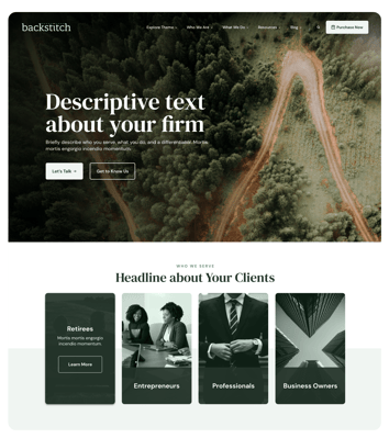
The Brief: Bringing Intelligent Website Design to a Broad Audience
When it comes to our why, Primitive deeply believes in intelligent design and thoughtful brand awareness that begins with a deep and valued client relationship. And helping small businesses and new brands gain traction and generate revenue with custom websites brings us joy every time. But we know that not everyone has the budget for a custom website. Enter the HubSpot Marketplace.
We ramped up to bring our top-tier web skills to a new client base. As an agency founded by an entrepreneur, staffed with former entrepreneurs, and serving entrepreneurs—we know what it feels like to work lean.
Founded by Entrepreneurs
Supporting Entrepreneurs
Owning Our HubSpot Platinum Partner Status
We build our custom websites on a proprietary platform: Bind. And while we love Bind’s flexibility and features, we knew we needed a more accessible platform geared toward users with no development experience. As HubSpot Platinum partners, our team was already well-versed in HubSpot’s capabilities. HubSpot Hubs like CRM, Sales, Marketing, and CMS are used by many Primitive clients. HubSpot’s robust analytics are a marketing dream. With the expansion of the HubSpot development space and the work HubSpot has done to make their CMS more user-friendly, now seemed like a good time to enter the marketplace.
“Stitched gave me more insight into ways we—as HubSpot Partners—could be maximizing our use of the platform. I think our website theme will provide companies with limited resources a high quality website to help to grow their business. The attention to detail our team gave the default content, to help guide businesses, is at a level far above your basic website template.”
And this is where the real fun began.
Research: Knowing Our Audience
We knew we wanted to create a theme in an industry where we knew the market. While a broad website theme would still be successful and usable, it wouldn’t allow us to offer the details that make it an exceptional client experience. Going broad doesn’t let us drill down on elements like helper texts and writing prompts in copy fields, design that caters to specific service offerings, and essential backend security. Our choice: financial services. From websites, social, and more, we successfully help financial services firms generate revenue, leverage leads, and grow their client base.
See a few of our custom builds:
But with Stitched, our target audience was small firms who didn’t have the budget for a custom website. With this in mind, our entire team spent time on research and gaining new skills to serve our newest clients.
|
Research Deep Dive |
Team Role |
|
Business Development Lead |
|
Developer |
|
Marketing Director |
|
Copywriter |
|
Web Strategist |
|
Designer |
Stitched was a team effort. And that’s why we’re so proud. We took our existing skills, leveled up, and built a stunning, affordable end product.
“The big challenge for Stitched was creating and developing a theme that not only looked modern, but had customizations and functionality that worked within the boundaries of the design, content, and potential needs for a client.
We made sure that the theme was compatible for users of all skill levels—from beginners to advanced. And we gave each module or section of the website clear and precise instructions and guides.”
Making It Happen: The Build
What it took to build Stitched:
- Weekly stand-up meetings
- Full sprint loads
- Occasional late nights
- Skillset growth
The build itself was an all-hands project. We had people from across our teams lending expertise, knowledge, and grit. Designers and strategists worked together to create inspired designs. Developers gave platform input on potential design issues with non-developers building the sites. And as a team, we solved those problems and kept our premium website feel.
One of our favorite examples is how we created a way to make sure, no matter your brand’s colors, the site looks professional. There will be no clashing with your logo. Instead of having a few theme colors to choose from, our developers created a feature that allows you to choose a primary color that matches your logo or primary brand color. And then the theme automatically generates secondary colors that look good. You know, like a professional designer put it together.
While this feature sounded great on paper (or Slack chats)—it wasn’t easy to implement. Josh Mathis, Product Designer, had this to say about creating our color matching feature:
“One issue was the ability for the user to pick the primary color used by the theme. Stitched uses one main color throughout the theme and accent colors are shades and tints of the primary color. We had to create a way for the theme to determine those light and dark values. We could have left it at a few color choices, but that wouldn’t feel custom.
Because we built Stitched to adhere to modern accessibility standards, the generated colors also had to meet the recommended contrast ratios. The easy explanation for this is: if the user picked a light blue color, the background color had to still allow any text placed on it to be easily readable. There was lots of math involved, but in the end we came up with a great solution!”
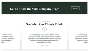
If you work at a wealth management firm, and you’re not ready for a custom website, we know Stiched is the right fit for you.
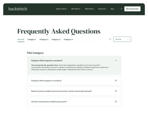
Jeremy Giannavetti, Product Designer, describes Stitched as, “A perfect option for a financial services company that wants to build a beautiful, hassle-free website while leveraging all the tools and power of the HubSpot platform.”
|
|
Getting Back to Why
A standout on this project was the chance for every team member to get back to the why. The why of the modules we choose, the copy we use, the coding style we build with. Instead of leaning into our traditional process, we re-evaluated every step. Lauren Pugh, Copywriter, says it best:
“I was challenged to slow down and rethink my creative and strategic processes. I stopped and thought, ‘Okay, why do we actually do xyz and why do we do it in this way?’ From there I had better direction to break down these processes to format each piece and offer guidance to bring value to the businesses using these templates.”
So whether you’re a wealth management firm working to meet revenue website goals with a new website, a small business looking for a template that looks like a custom website, or just curious, click on over to meet Stitched.
SHARE THIS POST:

About the writer, Danielle Holmes
Danielle has been telling stories her whole life. And for the last five years she’s been telling the stories of entrepreneurs, small businesses, and companies bringing quality products and services to customers. Danielle got her start in academia. With degrees in English and anthropology, she spent more than half a decade learning how to ask questions, tell stories, and do thorough research. Her approach uses ethnographic interview and coding techniques to better understand brands and clients. She listens for key words, recurring topics, and core ideas to know the client and their ideal audience. She uses that data and understanding to tell stories—true to brands—that create loyal customers.
