BLOG The 5 Website Elements You're Not Using
The 5 Website Elements You're Not Using
POSTED BY Alison Quisenberry | May 9, 2022

In today’s world of technology, it’s extremely common for your first point-of-contact with a potential client to be your website. They Googled a broad search question and your product or service appeared.
So, what now? Does your website provide an experience for that visitor that leads to a conversion? Is it visually appealing, easy-to-use, and leave them with a positive impression of your business? We’ve put together a list of five website elements you may not be using that will help you check every one of those boxes.
Mobile Optimization
As the world spends more and more time on their cellphones, it becomes increasingly important to ensure that when people visit your website from their iPhone, it is a user-friendly, enjoyable experience. According to the latest data, mobile usage has taken a far lead to desktop usage on the internet with 55% of traffic attributed to mobile devices and 42% from desktop users (the last 3% comes from tablet usage).
We’ve all been there. Whether you’re trying to revamp your wardrobe, check on the latest sports stats, or order late-night takeout – you end up frustrated. This could be due to poor navigation, slow loading times, or buttons that simply won’t “click.” Don’t let a poor user experience like this happen to your customers. So, where should you start?
Mobile-First Design
When building websites for clients at Primitive, we listen to the numbers. Because most users will be visiting from their hand-held devices, we build the mobile site first to ensure that it has a strong mobile foundation. Once that goal is met, we then move on to building the desktop website from there.
Optimize Page Speed
The best way to do this is through customization. When you choose to outsource a custom web design, this allows for a more sophisticated site. Primitive’s web design and development team builds every element possible. By doing this, we avoid using plugins, which can compromise not only the performance, but security of a website.
Testing
You’re a business owner, but you’re also a consumer. Test your own website before you let customers or clients use it and see how it feels. If you find issues that frustrate you, there’s a great chance other website visitors will feel the same. Work out the kinks and bugs before you push it live to ensure a great user experience.
Animation
Another word designers use for animation is interactive. No matter what product you sell or service you offer, make your web pages come alive with subtle touches of animation such as a moving logo, shuffling images, or movement of objects. Example: popping the tab of a Coca-Cola can. How can you bring your product to life?
Accessibility Features
When planning your website elements, you always want to consider people with disabilities. Fortunately, there are ways to create a site that make it easy for everyone to use. We’ve compiled a list of visual and technical elements you can incorporate to ensure your website is user-friendly for anyone that visits.
Color Contrast
When choosing your color palette, you want to make sure your background and forefront colors have enough contrast that they aren’t challenging to read. If you’re using light text on a light background, that can prove to be quite challenging for someone who is visually impaired.
Don’t Rely On Color
Color is often used to convey information. For example: green means go. In moderation, this is okay; however, it is useful to make sure the information is understandable without color for those who struggle to discern different colors from one another.
Clear and Concise Navigation
Make it easy for users to find their destination within your site. Do this by keeping your navigation consistent. Provide larger, easily-clickable buttons for your different webpages.
Different Viewing Sizes
Optimize your website by including different viewing sizes. If someone increases the font size on their mobile device, you want your website to adapt. Otherwise, when that person visits your site, your elements will be out of place and your information may be hard to understand.
Whitespace
We’ve all heard it before. Less is more. This is the case in many website designs as well. Whitespace is empty space around website elements. Commonly, business owners see whitespace as wasted real estate; however, the empty space is often more valuable than overwhelming a visitor with too much information or visual stimulation.
Leaving whitespace in your design provides a certain level of sophistication. Compare it to walking into a clean, sophisticatedly designed house versus a cluttered space where nothing really matches. Which do you want your business to reflect?
Whitespace also allows for better legibility. Whitespace can be used as a roadmap. The empty space can group and guide your content so it’s more easily digestible for your site visitor.
Call-To-Action Banners
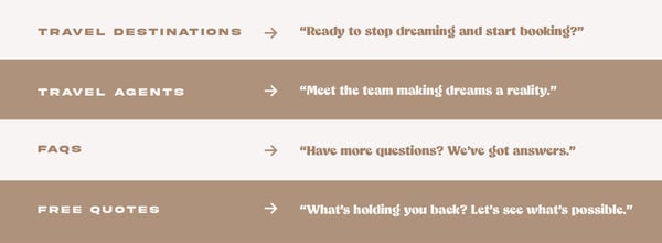
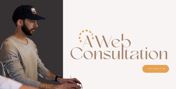
In the end, the big picture goal of using your time and resources to create a user-friendly website is to find leads and make conversions. Let your site help you do this. On every new page of information you include, give users an opportunity to contact you or redirect them to a page that leads them closer to their destination. Guide them to a sale. Our web copywriters have created a few examples, based on a travel agency, of how you can tailor your call-to-action banners for different pages on your website.

Primitive’s website design and development team is ready to implement these elements and more to help your business reach its highest potential. Through years of experience and practice, we know how to build a website that brings visitors in and keeps them coming back, providing growth and value for your company. Let’s get started.
SHARE THIS POST:

About the writer, Alison Quisenberry
Alison is a Copywriter at Primitive who turned what she only ever thought could be a hobby into a career. What began as entries into creative writing competitions in grade school has become the opportunity to support and empower brands through words and language. Before joining the Primitive Pack, Alison refined her skillset and learned the importance of a deadline producing TV news. A Lubbock local, Alison moved further south for three years to obtain a Bachelor of Science in Electronic Media and Mass Communication from Texas State University. Go Bobcats! Now back in West Texas, you’ll typically find her on the patio of a local bar with friends, watching a documentary with her dog, Finley, or winning a game of cards at family dinner night!
