BLOG Landing Page Best Practices
Landing Page Best Practices
POSTED BY The Prim Pack | Jul 31, 2020

Digital marketing is a constantly evolving process. Not only do technologies and methods adapt and change, but your customers and their situations and needs are constantly changing as well. As a marketer, it’s your job to be aware of advancements in marketing technology, and the dynamic circumstances surrounding prospective customers.
Fortunately, there are aspects of digital marketing that stand the test of time. One of these is the actual process of generating leads. We’re sharing more on that process below, and then we’re going to focus on a specific portion of that process: the landing page.
The Lead Generation Process
Lead generation is a bit more nuanced and technologically advanced than it has been in the past, but the bones of the process remain the same. We’re absolutely simplifying here, but below is a basic structure for the flow of potential leads:
- A visitor comes to your website or blog with a problem or need.
- Because of your incredible content (hint, hint), this visitor is interested in receiving an offer from you.
- The visitor clicks on a CTA to receive the offer.
- After clicking this CTA, the visitor is directed to a landing page that has a form on it.
- The visitor fills out this form, hits submit, and is now considered a lead.
- In return, the lead is taken to the offer or receives it in their email.
Again, this is absolutely an over-simplification of the lead generation process, but it gives you a good idea of what happens, and why it’s important to nail your landing page. (More on that below.)
Landing Page Best Practices
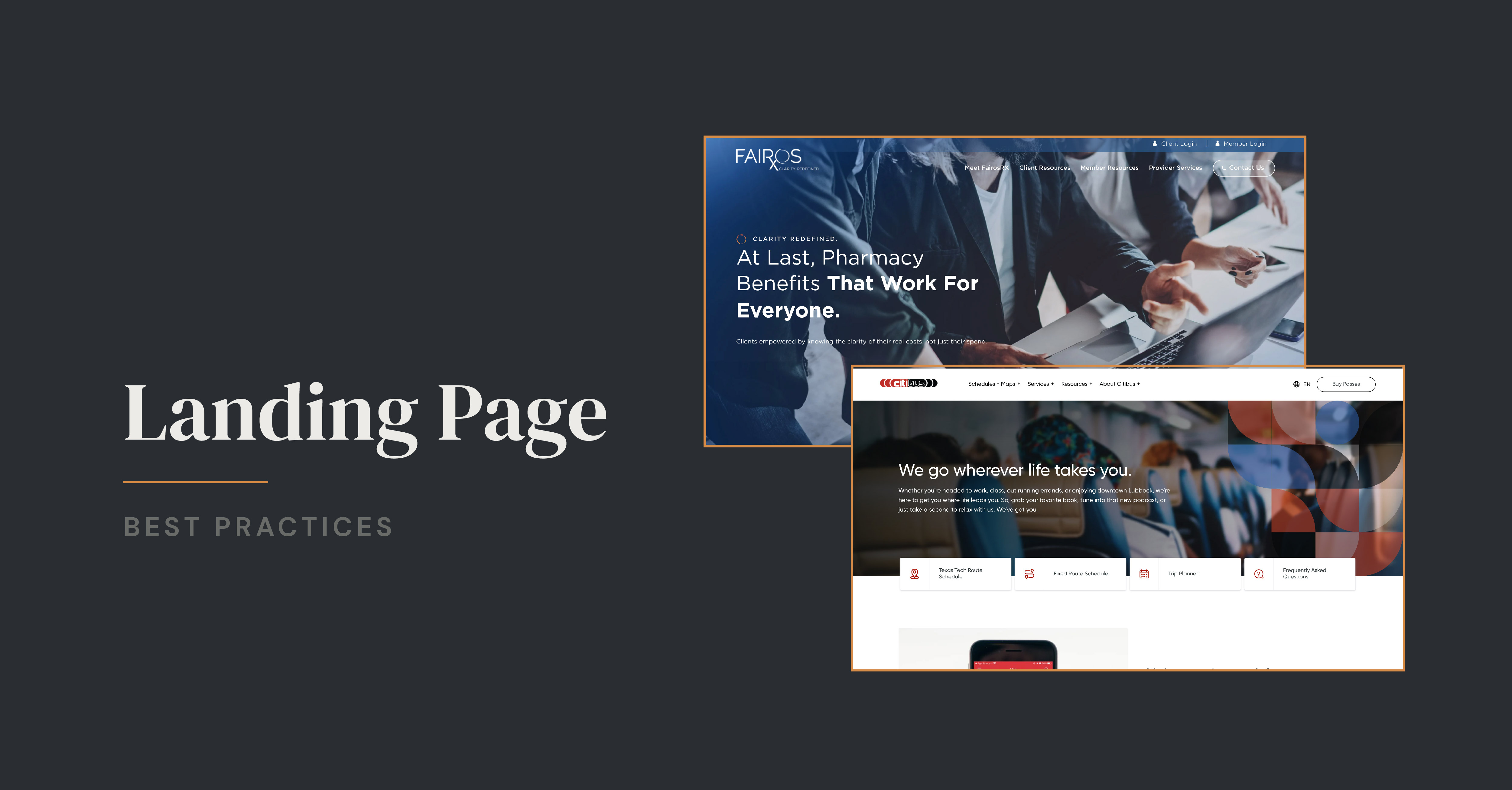
Any moment of the lead generation process could make it or break it for your digital marketing efforts, but the landing page is definitely critical. If you don’t get your landing page right, how can you expect a visitor to fill out your form and become a lead? To help you crank out excellent landing pages every time, here are four things to think about carefully.
- Copy: All landing pages have a bit of copy on them to help a visitor know what they can expect with this offer, and why it’s worth their time. The trick here is to be abundantly concise. Spell out why this offer matters, but don’t give away so much that a visitor doesn’t feel the need to fill out your form. Bullet points can definitely be your friend, and focus on using an active voice.
- Form: Your form length should parallel your offer. If your offer is more generic or introductory, you might not ask a visitor to fill out quite as many fields as you would for an extensive, in-depth case study. At the same time, your form needs to help you get the information you need about your new lead.
- Design: A landing page is not the place to put the most intricate designs you have ever worked on. Instead, you want to keep things clean and neat to draw a visitor’s eye right where you want it: the form. If you have too much going on in terms of design or try to insert a lot of links, visitors could end up distracted and completely forget to fill out your form. Save more of that for your homepage or for a blog post.
- Analytics: The only way to be sure your landing page is performing well is to track its data and test small changes. Use this information to identify what works, then replicate it for the other landing pages on your website.
In many ways, landing pages on your website kickstart the lead generation process. Because of this, you want to be certain that they’re working for you, and not against you. But, landing pages are just a portion of a successful digital marketing strategy.
To help you make sure all of your digital marketing efforts are effectively working toward growing your business, we’ve created an in-depth, helpful ebook about building a healthy digital ecosystem. It covers everything from your website, to lead generation, to social media, and more. Click the image below to grab yours!
SHARE THIS POST:

About the writer, The Prim Pack
Primitive is a full-service digital agency specializing in strategy, branding, web development, and technology solutions. With a passion for innovation and a commitment to helping businesses grow, our team crafts digital experiences that make an impact.
