About Peoples Bank
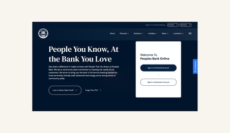
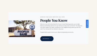
Peoples Bank is a community bank, with branches across Texas. They got their start in 1999, in Lorenzo, Texas. Since then, they’ve added eleven other locations across the state. And they also offer in-house loan services. They’re ag lending experts and have a dedicated Home Loan Center. What really sets them apart from competitors is their focus on customer service.
 The Vision
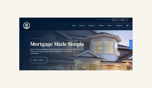
A glow up from their former site, built in 2015, by Primitive. They envisioned a UX friendly website with simple navigation and fewer steps for a potential customer to contact them. They also wanted to make it easy for current customers to access vital information like banking holidays, speciality loan products, and logins.
As an established business, the website also needed to feel fresh AND like their existing brand. They needed a refresh, not a rebrand.
The Brief
- UX focus
- Mobile-first design
- Easy navigation
- Highlight lending services
- Show their expertise
- Give the website a modern, creative refresh
- Reflect their established brand
The Team
Account Manager: Jeter Cotton
Developer: Matthew James
Web Strategist & Copywriter: Danielle Holmes
Designer: Morgan Mann
Our Approach
Peoples Bank is a long-time Primitive client. We not only created their last website, but also partner with them on other digital marketing projects. And since the start of that partnership, we’ve also changed our approach to web design—going from a traditional model, to a GDD approach.
Why Choose GDD Website Design
Our agency, Primitive, specializes in the GDD approach. GDD stands for Growth-Driven Design. Basically, GDD means we build one page at a time, with a launchpad that can stand on its own and quick-launch. You don’t have to wait six months or a year to launch your site.
The tl;dr on GDD:
- It saves you money
- It launches sooner
- There are fewer redesigns
- We can respond to real-time change and feedback based on data and customer feedback
If you’re curious about our step-by-step process, read here. For Peoples Bank, because of the compliance steps in the financial industry, they opted for a traditional launch.
How We Created the Peoples Bank Website
We started by taking the time to hear what Peoples Bank needed and wanted on the new site. After that, our strategist did market research to better understand the needs of the industry. After completing initial research, our designer and copywriter worked collaboratively to create functional, calming, and easy-to-navigate design and copy.

The Pages
- Home
- About
- Personal Banking & Lending
- Business Banking & Lending
- Home Loans
- Ag Lending
- News
- Locations
- Resources
Highlights
Sticky Navigation for Easy Log In
We wanted existing customers to be able to sign in to their personal or business accounts—no matter where they were on the website.
Tabbed Content
We wanted an easy way for a user to explore all services Peoples Bank had for individuals and businesses. We subbed tabbed content with easy navigation for the previous site’s multiple pages.
Showcasing Brand Values

We love the authentic Peoples Bank images paired with their promises to clients. Peoples Bank’s promises speak to who they actually are, not just their services.
Education
We think that knowing more about a big decision, like a home loan, can help someone feel comfortable taking the next step. So we showcased the mortgage process with Peoples Bank.
Eye-Catching Movement
We wanted the luxe feel of movement on the new site. Don’t get us wrong, a static site is fantastic and
can be an effective tool. But, adding movement elevates content and the feel of an entire site.
We’re pretty infatuated with the new Peoples Bank site.
And if any of these elements catch your eye, we’d love to see how we can glow up your site!


 The Vision